Page updated Feb 2014 by Richard Pauli
CopyCommons cc Take it Away | Speak (at) rpauli dot com
The chart below has linked hotspots. In the lower right corner of the chart notice the temperature line for the current year. There are seven future projections plotted.
The graphic IPCC Chart uses data from special report emissions scenario for the IPCC. Links below in blue are summarized projections for each degree change taken from the book "Six Degrees, Our Future on a Hotter Planet" - Mark Lynas and videos segments from National Geographics.For an excellent video introduction to the global warming problem see the National Geographic video of Global Warming 101
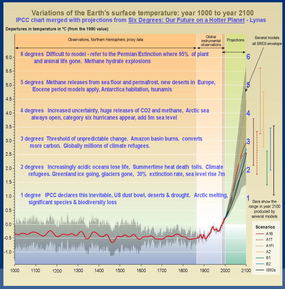
The composite chart shows past temperature changes and projected changes to the year 2100. The temperature scale counts upward from the year 2000 - which represents 0 degrees of change. The red line is the average temperature before the year 2000. Where the red line splits, these are the future projections, and each model scenario is a different color. The vertical color lines on the right represent the temperature range for each of these models. Note that all scientists agree that we will see increases of at least 1 degree Centigrade. The blue text on the left side describes some events for each temperature level.